Facebook ad examples and the patterns behind them
Facebook and Instagram ad examples grouped by the layout pattern each one uses, so you can reproduce the structure rather than copy the picture.
Updated 31 August 202612 min read
What an ad example can actually teach you
You can learn the structure. That is roughly it, and it is more than most galleries admit.
When you look at a Facebook or Instagram ad in the wild, you are seeing one variable in a system of six. The creative is visible. The offer behind it is not, and neither is the audience it was served to, the landing page it points at, the bid strategy, the frequency, or whether the account is buying that impression at a price that makes any sense. An ad can be beautiful and structurally sound and still be the reason an account is losing money, because the discount is too thin or because it is being shown to people who bought the same product last week.
So the useful unit of study is not the picture. It is the layout pattern: where the product sits, how much of the frame the copy takes, what the eye lands on first, and what survives when the whole thing is scaled to the width of a thumb. Patterns transfer between categories. Pictures do not. A skincare brand's hero shot teaches a B2B software company nothing, but the composition rule underneath it — single subject, hard separation from the background, headline in the upper third — transfers to almost anything.
What follows is a taxonomy of eight layouts that appear constantly across Meta feed and story placements: what each is made of, the job it does, and the conditions under which it stops working.
The eight layout patterns
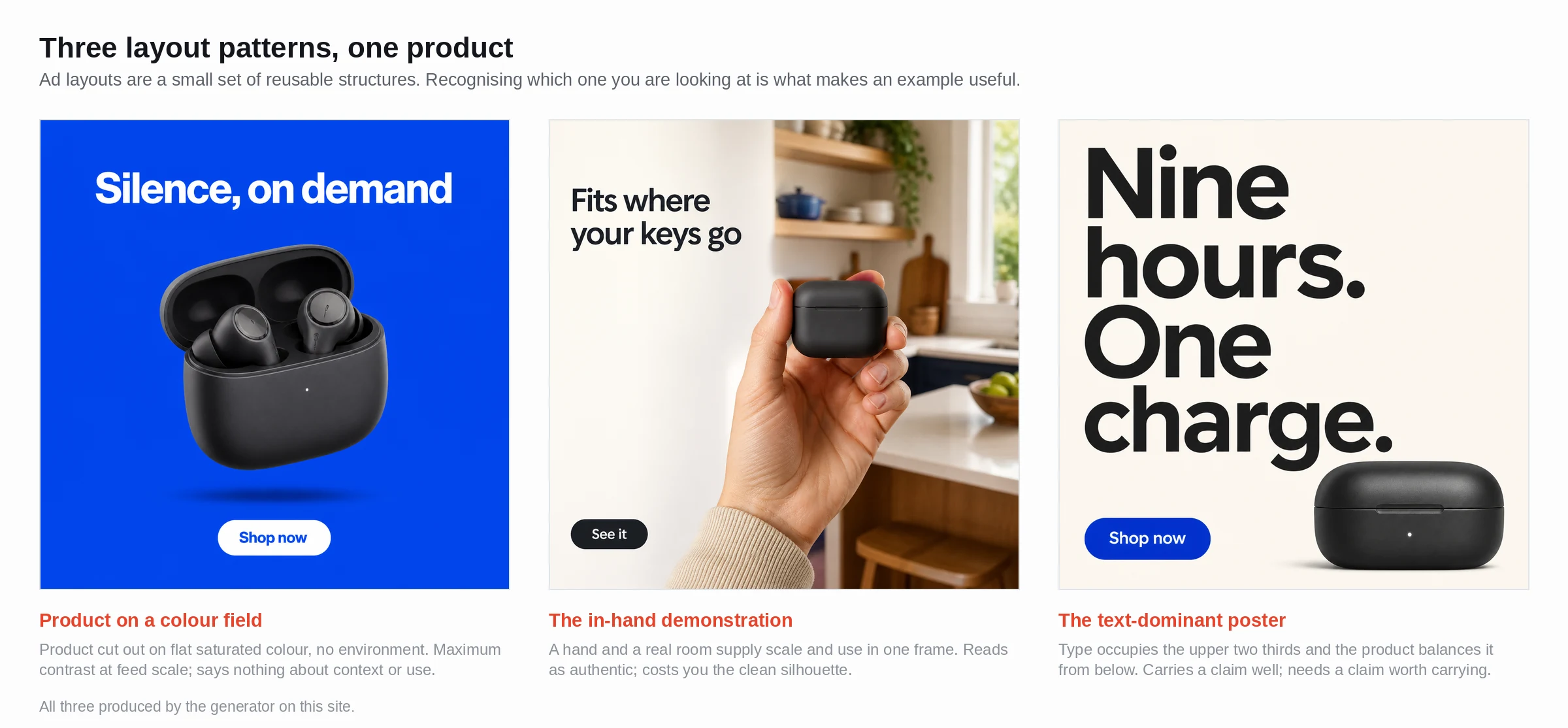 The same product can carry a colour-field layout, a text-dominant poster or an in-hand demonstration; the skeleton, not the styling, decides what the eye finds first.
Product on a colour field
A single product, cut out or shot on seamless, floating on a flat saturated background, with a short headline set above or beside it. The pattern rests entirely on separation. If the product's dominant colour sits close in value to the field behind it, the silhouette dissolves at feed scale and the ad reads as a coloured rectangle with words on it.
Its job is recognition. Someone who already knows the category should be able to identify what is being sold in well under a second, and that is the whole ambition. It fails for products with no distinctive outline — a bottle of supplements looks like every other bottle of supplements — and it fails the moment a brand puts three products on the field at once, because then there is no focal point and the eye has to work for it.
Best at 4:5, 1440 x 1800, where the extra vertical room lets the product hold the middle band with the headline clear above it.
The in-hand demonstration
Hands, cropped tight, using the product. No face, usually no background. This is the closest thing the industry has to a default for physical goods, and the reason is scale: hands give a size reference that a packshot cannot, and a tight crop survives being compressed into a 400-pixel-wide feed slot.
Google's ABCD playbook makes the same recommendation for video — use tight framing on the subject, "whether it's a product or a person" — because a tightly framed subject is easier to process. The still-image translation of that advice is blunt: crop until it feels uncomfortably close, then crop further.
It fails when the hand becomes the subject. If the manicure, the sleeve or the watch is more interesting than the thing being held, you have made an ad for a hand.
The before-and-after split
Two states, divided by a hard vertical or horizontal line. Problem on the left, resolution on the right, or top and bottom in 9:16. The pattern carries an implicit claim, which is exactly why it is regulated: Meta's Health and Wellness advertising policy restricts before-and-after imagery and depictions of unexpected or unlikely results, so a split that sails through for a home-storage brand gets rejected for skincare or weight loss.
Structurally, both halves have to be shot identically. Same angle, same light, same distance, same lens. The instant the "after" is warmer or closer or better lit, an experienced viewer discounts the entire thing, and the ad becomes an argument about photography rather than about the product.
It also fails in 9:16 more often than people expect, because a horizontal split drops half your argument into the bottom safe zone.
The text-dominant poster
Copy takes sixty per cent or more of the frame and the image is reduced to a texture, a wash, or a small supporting element. This is the pattern for things whose value is a claim rather than an object: a service, a policy, a piece of software, a price.
It has one strength no photographic layout has. It can be read at any size. It also has one weakness that kills most attempts, which is that people write three lines where one would do. A poster with a nine-word headline in 40-point type is a poster. The same layout with a twenty-eight-word paragraph is a document, and nobody reads documents in a feed.
Worth knowing that Meta dropped the 20% text rule in 2020, so heavy text overlay is no longer penalised in the auction by that specific mechanism. It is still penalised by the reader.
The flat lay
Product plus context objects, shot straight down on a plain surface. A kettle with beans, a cup, a folded cloth. It sells a scenario rather than an item, and it is the most forgiving pattern to shoot badly, because a top-down angle hides most lighting sins.
It is also the pattern that decays fastest at feed scale. A flat lay with eleven objects has eleven focal points, which is the same as none. The rule that rescues it: one object at full size and full contrast, everything else deliberately cropped by the frame edge or thrown slightly soft, so the composition has a hierarchy instead of a census.
The social-proof card
A quotation, a star rating or a review screenshot as the primary visual, with the product demoted to a corner. The structure is attributed line, source, product, call to action. It works because the claim is not arriving in the advertiser's first-person voice, and because the visual grammar of a review — stars, a name, a plain sans-serif — is recognised before it is read.
It fails in two specific ways. An unattributable quotation is both a policy problem and a credibility problem; a review card with no name reads as invented even when it is not. And a five-star graphic carrying a thirty-word quotation is illegible at thumbnail size. If the quotation will not cut to a single line, use a different pattern.
The problem frame
The ad opens on the failure state rather than the product. Tangled cables, a cluttered drawer, a spreadsheet with fourteen tabs. The product arrives small, late, or only in the copy. This is the highest-variance pattern in the set. It earns disproportionate attention when the problem is instantly legible and wastes the impression entirely when the viewer does not recognise the problem as theirs.
Use it when the pain is visual. Do not use it when the pain is abstract, because a picture of an abstract problem is a stock photo of someone holding their head.
The annotated packshot
Product centred, with two to four short callouts pointing at features: a leader line, a label, a number. Borrowed from catalogue design, and it does something no other pattern does, which is answer objections inside the creative, before the click.
The failure mode is density. Four callouts at 1440 x 1800 is comfortable. Eight is a diagram, and diagrams do not survive being viewed at 400 pixels wide on a moving screen. If you need eight, what you actually need is a landing page.
Matching a pattern to a placement
Placement decides how much of your layout anyone sees. These are Meta's current recommended values, worth restating because the 1080 x 1080 square that half the internet still quotes is no longer what Meta recommends for feed.
| Placement | Ratio | Recommended | Minimum | Patterns that suit it |
|---|---|---|---|---|
| Facebook Feed image | 4:5 | 1440 x 1800 | 600 x 750 | Colour field, in-hand, annotated packshot |
| Instagram Feed image | 4:5 | 1440 x 1800 | width 500 | Colour field, flat lay, social-proof card |
| Instagram Stories image | 9:16 | 1440 x 2560 | width 500 | Text poster, problem frame |
| Instagram Reels video | 9:16 | 1440 x 2560 | width 250 (under 30s) | In-hand demonstration, problem frame |
| Facebook Stories video | 9:16 | 1440 x 2560 | width 250 | In-hand demonstration |
Aspect tolerance differs by surface — roughly 3% on Facebook Feed against roughly 1% on Instagram Feed — so a file that passes on one can be cropped on the other. Text limits differ too, and this is where people get caught: Meta's Ads Guide lists a 27-character headline for Facebook Feed against 40 for Instagram Feed, with primary text of 125 characters on Instagram. Write to the shorter number and you are safe in both.
For 9:16, the constraint that decides the design is the safe zone. Meta keeps text and logos out of roughly the top 14% and bottom 35% of the frame, with about 6% clear on each side. On a 1440 x 2560 canvas that leaves a usable band of roughly 1,300 pixels in the middle. Any pattern with a horizontal split has to be redesigned for that band rather than resized into it.
What stops a scroll at feed scale
Contrast and a single focal point. Not detail, not craft, not the retouching that took the afternoon.
The practical test is to export the creative, scale it to about 400 pixels wide, and look at it for one second at arm's length. If you cannot name the product and read the headline in that second, the ad does not work, and nothing about the full-resolution file changes that, because almost nobody sees the full-resolution file. Google reports that around 70% of global watch time happens on mobile, and feed images are consumed on those same screens under worse conditions: outdoors, one-handed, at speed.
Three consequences follow. Put the highest contrast in the frame at the point you want looked at first, and nowhere else. Keep type above roughly 40 pixels of cap height on a 1440-wide canvas, which is larger than it feels in a design tool. And strip background detail, because at thumbnail size texture and gradient behave as noise, eroding the subject-to-ground separation the whole composition depends on.
Creator-style creative and the case for iteration
Creator-style and UGC-looking ads are a production style, not a ninth pattern. They almost always sit on top of the in-hand demonstration or the problem frame with the polish deliberately removed: handheld framing, on-device typography, a person talking straight to camera. Google's ABCD guidance points the same way for video — if people appear, open with them on screen, addressing the audience.
The economics are what make the style interesting. Because each execution is cheap in perceived production value, the winning approach is volume: eight variations of one idea rather than one perfect film. That only holds if the eighth variation costs roughly what the first did, and this is where most teams stall, because the design queue turns a five-minute idea into a three-day request. Producing those variations from a written description with an AI ad generator takes the resizing and re-typesetting out of the loop, so the testing budget goes on hypotheses instead.
What these examples cannot tell you
A gallery of ads is a gallery of surviving creative, not winning creative. Ads stay live for reasons unrelated to performance: an agency retainer, a brand campaign with a fixed flight, an account nobody has audited since spring. Meta's Ad Library will show you that an ad is running and when it started, but it publishes spend and impression ranges only for ads about social issues, elections or politics. For everything else, you are looking at longevity and guessing.
You cannot see the offer, which is usually the single largest lever on conversion rate. You cannot see the audience, and the same creative served cold versus served to a retargeting pool produces results that differ by an order of magnitude. You cannot see the landing page, where most of the drop-off actually happens, nor the frequency, nor the account's own baseline, which is the only thing that makes any number mean anything.
There is a particular trap in copying a large brand. A company with substantial existing awareness can run a layout that communicates almost nothing — a mood, a colour, a logo — because the recognition has already been bought. A business without that recognition running the same layout has purchased an impression that says nothing at all. Copy structure from businesses at your scale and study the large brands only for craft.
The honest use of a swipe file is as a source of hypotheses. This layout, that hook, this crop, tested against your own creative, on your own audience, with enough spend to tell a result from noise.
Building your own version of these layouts
Name the pattern before you open anything. Write the sentence: colour field, product centre, headline upper third, 4:5. A brief in that form takes half a minute and settles every question that would otherwise get resolved by fiddling.
Then produce it at native size rather than resizing afterwards. Export at 1088 x 1360 for 4:5 feed, 1088 x 1088 for square, 1088 x 1936 for stories and reels, all comfortably above Meta's stated minimums and all downsampled cleanly by the platform. Describing the product, the pattern and the shape and letting an ad generator render the headline and call to action onto the frame at those dimensions avoids the export-at-the-wrong-size mistake that gets creative letterboxed or bounced. On 9:16 the copy has to sit inside the centre band, clear of the interface furniture top and bottom, which is a composition decision and not a cropping one.
Build three patterns per product, not three variations of one. A colour field, an in-hand demonstration and a text poster test genuinely different propositions — recognition, use, claim — and whichever wins tells you something about your buyers. Three colour fields in three colours tell you about colours.
Then run the one-second thumbnail test on all three before anything goes near an ad account. Most of what fails, fails right there.