Google Display ad sizes
The full Google Display Network size list, which five sizes carry most of the inventory, and how to design one layout that survives every crop.
Updated 31 August 202610 min read
Three systems wearing one name
Google runs three separate image ad systems, each with its own requirements, and almost every "display ad sizes" list on the internet blends them into one table. That blend is why people build twenty banners for a campaign type that never serves them, or upload a 1200x628 hero and find the ad cannot fill half its placements.
The three are: uploaded image ads, fixed-pixel creatives at IAB standard sizes, capped at 150KB; Responsive Display Ads, where you supply a small set of large source images plus text and Google assembles and crops the ad at auction time; and Demand Gen image assets, which look like RDA assets but sit in a different campaign type with a wider ratio set and different surfaces — YouTube, Discover, Gmail.
One rule carries most of the weight here: fixed banner dimensions apply only to uploaded image ads. Everywhere else you are supplying ratios, and the pixel numbers are quality floors rather than layouts.
Uploaded image ads and the full size table
These are the fixed sizes, from Google's uploaded display ads specifications page. Accepted formats are GIF, JPG and PNG at a maximum of 150KB. Animation must stop after 30 seconds — looping is allowed as long as it halts at 30 — and animated GIFs must run slower than 5 FPS.
| Group | Size | Common name |
|---|---|---|
| Square and rectangle | 200 x 200 | Small square |
| Square and rectangle | 240 x 400 | Vertical rectangle |
| Square and rectangle | 250 x 250 | Square |
| Square and rectangle | 250 x 360 | Triple widescreen |
| Square and rectangle | 300 x 250 | Inline rectangle |
| Square and rectangle | 336 x 280 | Large rectangle |
| Square and rectangle | 580 x 400 | Netboard |
| Skyscraper | 120 x 600 | Skyscraper |
| Skyscraper | 160 x 600 | Wide skyscraper |
| Skyscraper | 300 x 600 | Half-page |
| Skyscraper | 300 x 1050 | Portrait |
| Leaderboard | 468 x 60 | Banner |
| Leaderboard | 728 x 90 | Leaderboard |
| Leaderboard | 930 x 180 | Top banner |
| Leaderboard | 970 x 90 | Large leaderboard |
| Leaderboard | 970 x 250 | Billboard |
| Leaderboard | 980 x 120 | Panorama |
| Mobile | 300 x 50 | Mobile banner |
| Mobile | 320 x 50 | Mobile banner |
| Mobile | 320 x 100 | Large mobile banner |
Twenty sizes, four orientation families. Google's page also lists a few additional dimensions available only in Poland, Sweden, Denmark and Norway, which is worth knowing before a Nordic media plan lands on your desk with sizes you have never heard of.
The spread is the real story. A 300x1050 portrait is a column; a 970x90 is a letterbox roughly the height of a paragraph. No single composition survives both, and anyone promising that a smart crop will handle it has not tried fitting a legible call to action into 468x60.
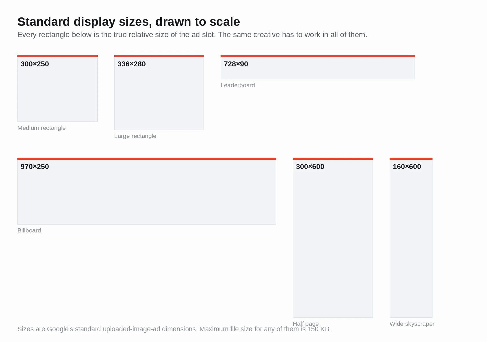 Drawn to scale, the list stops reading like a spec sheet and starts reading like a design problem: 300x1050 and 970x90 have nothing in common except a logo.
Which sizes to build first
Google does not designate any display size as top-performing. This matters, because the set you have read a hundred times — 300x250, 336x280, 728x90, 300x600, 320x100 — appears nowhere in Google's help documentation as a performance ranking. It comes from third-party inventory analyses published by ad networks and agencies looking at their own placements. That does not make it useless. Publisher inventory genuinely is concentrated in those slots, and a network reporting its own impression mix is reporting something real. But it is a claim about where inventory sits, made by parties with a partial view of it, and pages that present it as Google guidance are inventing a source.
With the attribution stated, here is the opinionated version.
Build 300x250 and 336x280 first. They are the in-content rectangle that sits inside article bodies on both desktop and mobile, and they are close enough in shape that one layout covers both with a nudge. Add 300x600 next — the half-page is the sidebar unit that still holds attention on desktop publishers, and it gives tall artwork somewhere to live. Then 728x90 for desktop leaderboard inventory, and 320x50 or 320x100 for mobile.
That is five files. Skip 930x180, 970x90, 980x120 and 250x360 unless a specific publisher has asked for them; each is thin inventory and a fresh layout problem. 200x200 rarely earns its build time. The 580x400 netboard you will almost never see served.
The reason most advertisers build two sizes and stop is arithmetic, not laziness. Five sizes across two headline variants and two background treatments is twenty files, each hand-composed, each squeezed under 150KB, each needing a separate look at where the logo sits. Composition is where the afternoon goes, which makes it the part worth handing off: producing your master creatives with an ad generator that renders the headline and call to action into the image at 1:1, 4:5 and 16:9 leaves you resizing finished compositions rather than starting from an empty canvas five times.
Be clear about the limit of that. It gives you composed sources at the standard ratios. It does not emit 468x60, and nothing sensible does — a 60-pixel-tall banner needs a layout designed for 60 pixels, not a squashed square.
Responsive Display Ads: assets and character limits
RDAs work on the opposite principle. You upload assets, Google builds the ad. From Google's responsive display ads specs page:
| Asset | Ratio | Recommended | Minimum | Quantity |
|---|---|---|---|---|
| Marketing image | 1.91:1 landscape | 1200 x 628 | 600 x 314 | 1-15 (5 suggested) |
| Marketing image | 1:1 square | 600 x 600 | 300 x 300 | 1-15 (5 suggested) |
| Logo | 1:1 square | 1200 x 1200 | 128 x 128 | 1-5 |
| Logo | 4:1 landscape | 1200 x 300 | 512 x 128 | 1-5 |
Both the landscape and the square marketing image are required. This is the most common self-inflicted wound in display: a beautiful 1.91:1 hero, no square, and the ad simply cannot serve into square placements.
The text assets carry limits that shape how you write.
| Field | Limit | Quantity |
|---|---|---|
| Headline | 30 characters | 1-5 |
| Long headline | 90 characters | 1 |
| Description | 90 characters | 1-5 |
| Business name | 25 characters | 1 |
| Call to action | Automated | 1 |
Thirty characters is four or five words. "Handmade ceramic mugs, glazed by hand" does not fit; "Handmade ceramic mugs" does. Write short headlines as noun phrases rather than sentences, and assume the long headline is the one carrying your actual argument.
Where Google's own pages disagree
Two Google help pages give different recommendations for the square marketing image. The responsive display ads specs page lists 600 x 600 recommended, minimum 300 x 300. The older "Create a responsive display ad" page lists 1200 x 1200 recommended, minimum 300 x 300, and states a maximum file size of 5120 KB for images and logos — a number the newer specs page omits entirely.
Upload at 1200 x 1200 and the conflict stops mattering: it satisfies both pages, clears every stated minimum, and gives the ad room on high-density screens. This is also a good general instinct for any asset-based format. The recommendation is a quality floor and Google will downscale; it will not invent pixels you did not supply.
Demand Gen image assets
Demand Gen has a wider ratio set than RDA because it serves into YouTube, Discover and Gmail rather than publisher banner slots. From Google's Demand Gen image asset specifications:
| Ratio | Recommended | Minimum | Max file |
|---|---|---|---|
| 1:1 square | 1200 x 1200 | 300 x 300 | 5 MB |
| 1.91:1 horizontal | 1200 x 628 | 600 x 314 | 5 MB |
| 4:5 vertical | 960 x 1200 | 480 x 600 | 5 MB |
| 9:16 vertical | 1080 x 1920 | 600 x 1067 | 5 MB |
Up to 20 image assets per ad, JPG or PNG. The logo is square, recommended 1200 x 1200, minimum 144 x 144 — note that this is a stricter floor than the RDA logo's 128 x 128 — and here the file cap drops to 150 KB.
Two details from that documentation that almost nobody repeats. The logo gets circle-cropped in Gmail, and Google quantifies it: overall 21.46% is cropped, roughly 5.36% from each of the four corners. A square lockup with the wordmark running to the edges loses its edges. Second, Google's guidance says the safe zones for 9:16 images match those for 9:16 video — so treat a vertical still with the same discipline as a vertical film, keeping copy inside the middle band rather than pushing it toward the frame edge.
The 150KB problem
The file cap bites harder than any dimension, and it is barely discussed. 150KB is the total for an uploaded display ad, and a photographic creative blows through it before the design is finished.
Do the arithmetic. A 300x600 half-page is 180,000 pixels; a 970x250 billboard is 242,500. Compressing a real photograph — gradient sky, skin tones, product reflections — into 150KB across that area lands you at a JPEG quality where banding appears in the gradients and product edges go mushy. Those are exactly the parts the eye goes to. PNG is worse for photographs, often two or three times the size. And the cap is a hard reject, not a warning.
The fixes, in order of how much they buy you. Flatten the background to a solid colour or a two-stop gradient and drop the photograph in as a cut-out subject: flat areas compress almost to nothing, photographic noise does not. Keep text as vector type in your design tool rather than baking it into the photo layer, so crisp edges are not fighting the quantiser. Export the photo at exactly the ad's pixel dimensions — a 2x asset scaled in the browser costs file size and buys nothing at these sizes. Then export JPEG around quality 60-70 and inspect the gradients at 100%, not at the thumbnail where everything looks fine.
If a photographic 970x250 will not go under the cap without visible damage, the format is telling you something. Put the photography into RDA or Demand Gen, where you have 5 MB, and keep the uploaded banners graphic: flat colour, strong type, one product cut-out. That division of labour is why good display programmes look designed rather than photographed.
Designing one layout that survives every crop
Responsive formats crop, and knowing how they crop is the difference between an ad that looks composed and one that looks broken. When Google assembles an RDA it fits your landscape and square images into whichever slot won the auction, which means the image may appear letterboxed, tightly cropped, or with the ad's own text laid across part of it. You do not choose. You choose what survives.
So build for the crop. Keep the product in the central area across every ratio — the centre survives by definition, and Google's ABCD creative guidance points the same way when it advises tight framing on the subject, whether that subject is a product or a person. Keep essential text off the outer edges. Never park the logo in a corner, since Gmail's circle crop removes the corners. And never bake a headline into an RDA source image: the format supplies its own headline, and the two will collide in the same rectangle.
The other habit is to design at the ratio and export at the recommended pixel size, rather than designing once and cropping. A 4:5 composition built as a cropped 16:9 always reads wrong — the subject sits too large, and the breathing room that made the original work is gone. When you need one message composed properly at several ratios, generating each ratio as its own layout is the shortcut that holds up; an ad generator that outputs 1088x1360 for 4:5, 1088x1088 for 1:1 and 1936x1088 for 16:9 hands you three genuinely separate compositions instead of one image stretched three ways.
Two notes on fitting those into Google's slots. The 1088 square clears the 600 x 600 recommendation on the RDA specs page comfortably but sits just under the 1200 x 1200 that the Demand Gen page and the older RDA page ask for, so re-export at 1200 if you want to satisfy every page at once. And 16:9 is 1.78:1, not the 1.91:1 Google wants for horizontal assets: trimming about 74 pixels of total height from a 1936-wide file lands you on 1.91:1. That is a 30-second crop, and it is worth deciding where the trim comes from yourself rather than letting the uploader choose for you.